
Long gone are the days of static PDF style guides, where designers would painstakingly spec colors and typefaces, then proceed to ship them off to developers to magically build pixel-perfect interfaces.
Through the years, we’ve seen the design process transform from sketching with pencil and paper (not that we don’t still do it) to a design thinking approach of dynamic ideation and iteration. New technologies and ways of working have enabled the practice of Design to constantly become reinvented, in turn, allowing us to improve the products we build so that we can better serve our customers. With leaders like Apple, Google, and Facebook spearheading these revolutions, disrupting other industries such as pharma, where companies like GSK and Novartis have historically succeeded because of their innovative yet long-established, conventional approaches to work has been easier than ever before.
It was this culture of constant evolution that encouraged us to turn static PDFs into live, web style guides, where our company’s latest brand and UI standards could be found, and later on helped us move from designing individual pages of a website to using templates that included common modules and page layouts. Like a domino effect, it was all of this combined that drove us to recently create and adopt what we know now as a design system; a set of foundational guidelines, tools, resources, and UI components, that help us design better, smarter, and faster, customer-centric experiences.
How so?
Well, let’s take this – imagine being asked to solve the problem of getting patients to sign up for clinical trials that they may not be aware of. The goal is to increase their chances of feeling better and living longer, by designing a digital experience to bring clinicians and patients together.
Typically, the workflow would have been to build each of the individual components in those pages – buttons, dropdowns, text fields – and combine them together to create wireframes. This meant that your team would spend a significant amount of time laying out and coding the sign-up form and basic features; but… what about features that might make the experience even better, but you didn’t have time to explore those options given time
constraints? What about the features that could increase patient engagement and retention, and possibly help them lead better lives?
By designing and coding components once and reusing them to build your experiences, your team has now more time to iterate on new ideas and focus on solving more complex problems.
What is atomic design?
Brad Frost; designer, developer and systems thinker, coined the term “atomic design” to describe the process of breaking up a user interface into its smallest elements and reusing those same elements to build larger pieces, much like how atoms form larger molecules in chemistry. This way of thinking has become widely adopted for when we talk about design systems. As Brad says, “If atoms are the basic building blocks of matter, then the atoms of our interfaces serve as the foundational building blocks that comprise all our user interfaces.”
Components like buttons and text fields by themselves don’t serve much of a purpose – but it’s these same components combined into groups that can become a navigation bar, search form or… your clinical trials sign-up page. Once you begin to build these bigger pieces, or organisms, by default, you begin to establish patterns and templates for others to use.
Last but not least, it’s important to note (and never, ever, ever forget) that design systems are not just for designers – they’re for developers too. The code is the glue to the component library your team creates, and without it, you simply end up with a set of beautifully designed components that designers can re-use but developers… can’t. Simply put, when the wireframes that use the pre-designed components get handed off, an engineering team needs to build them, in turn, making it necessary for every component included in the system to have a coded counterpart.
So, how are the design and code tied together?
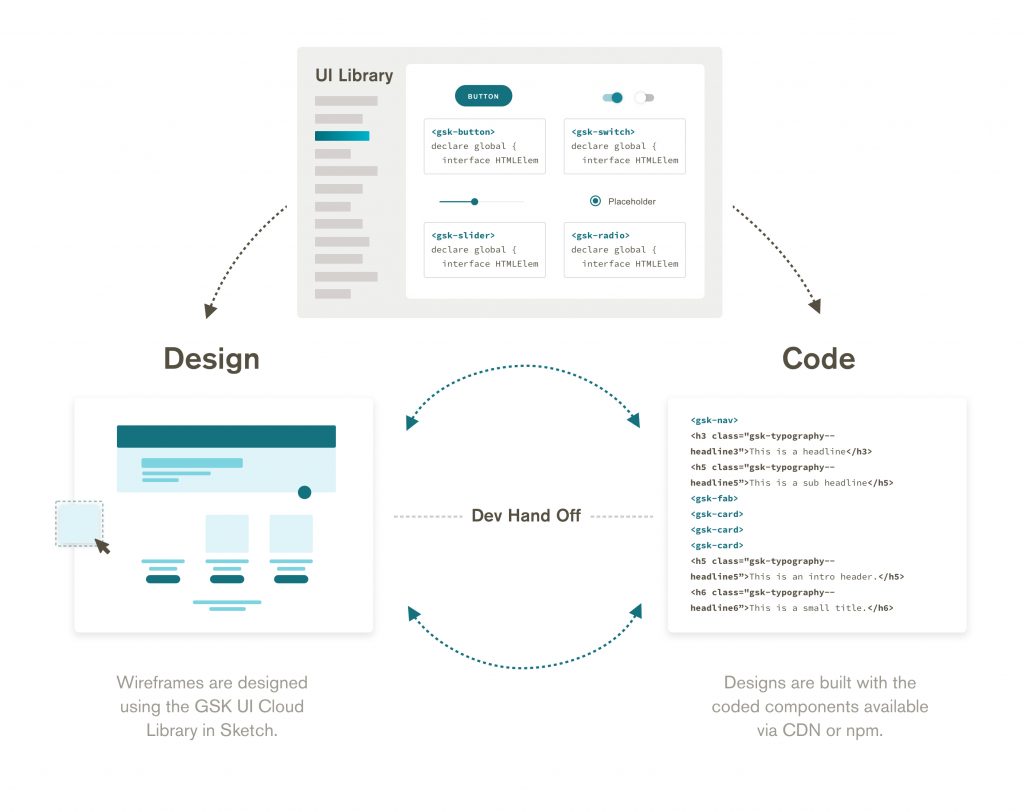
The same set of variables, or design tokens, are shared amongst each component in the system. The word “system” suggests that its contents are interrelated. In this case, components in design systems are connected through a common set of shared tokens that control the design and code from a global level. So, just like how our components are reusable, our styles that bring them to life are shared as well.
Design and development workflow at GSK using a central UI framework.
What are the benefits for a product team?
At a high level, implementing a design system can play a huge part in the success of projects by enabling teams to avoid duplicative work, iterate faster, and ultimately save money, time, and resources.
Speaking the same language
Because design systems are made up of multiple pieces of design and code that match each other, naturally, they establish a common language between designers and engineers. The gap between design and engineering is bridged by referencing, leveraging, and building with the same pieces. Designers no longer have to create deep documentation around UI because it’s already incorporated into the system, and developers don’t have to constantly rebuild experiences that have already been built.
Better, faster iteration
When we use the same building blocks, we speak the same language – and when we speak the same language, we’re able to iterate more and build faster. If our designers are freed up from agonizing over small and repetitive UI details, then our teams will gain more time to focus on testing ideas and coming up with new ones. A true testament to this, the recently launched design system at GSK has already enabled teams to build new digital experiences in a matter of weeks, rather than months.
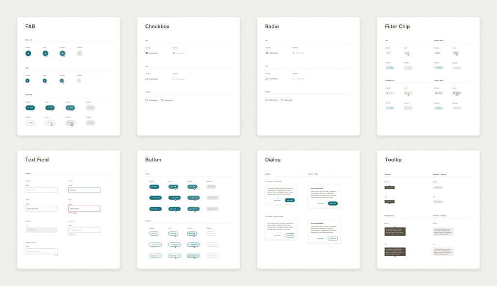
Some of the components included in the GSK UI Design Kit.
Share work
When teams use the same set of guidelines and components to build experiences, underlying technical choices are no longer barriers, allowing teams that are solving similar problems to be able to share and leverage each other’s work. The best part about this? At a certain point, the growth and evolution of a design system becomes driven by its current users, rather than the product team that built it in the first place.
What is the value for life science research?
Life sciences research presents certain issues for software design, both by the nature of the requirements themselves and by the organizational structures in which designers and developers work. Design systems have been successful at solving problems in the broader software industry, but offer unique benefits when applied to biomedical work.
Consistency helps scientists who work commonly with multiple applications.
Research scientists generally need multiple specialized applications to perform their work. When these applications are inconsistent and behave differently, it becomes difficult to move quickly between these tools, as both Hick’s Law and Jakob’s Law outline, which may have consequences ranging from brief delays to inaccurate or lost data. By reusing the same set of components, scientists can become familiar with a smaller set of workflows and move more easily across multiple applications over the course of their day, allowing them to enter their data quickly and correctly.
Consistent engineering improves data consumption and reuse.
Life science organizations, in particular, generate a large amount of interrelated data which – when exposed correctly – can allow scientists to follow a hunch or gain quick insight. However, even the best-planned APIs require time and effort to integrate into a user interface. Due to time or resource constraints, the project team may have to pass up this opportunity to create truly “explorable” applications. By defining a set of common patterns and committing them to code, a project team can produce a vastly more useful product with minimal extra effort.
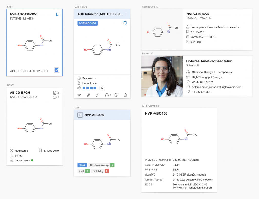
For example, suppose that a design system defines a popover for molecular compound information. When an application refers to compound information, designers can use this “stock” popover to provide contextual information without having to research and plan for a new component. Since the popover is a part of the design system, it will likely be in a shared component library, meaning that implementation effort is also minimal. Any developer using this component will automatically get a “plugged-in” version connected to a live data source. The end result: scientists have greater access to the rich data available, with comparatively little effort required from the project team.
This molecule details card is flexible enough to meet the needs of several applications, but stays familiar and consistent in each environment.
What does this mean for our teams?
When the way we work changes, so do our roles. Designers no longer have to rethink the same components and engineers no longer have to build inconsistent experiences from scratch. For teams, this doesn’t mean working less – it means working smarter.
By introducing new responsibilities to focus on advanced functionality and product features,
we can keep up with ever-growing rapid development cycles while at the same time helping push scientific research forward.
Acknowledgments: We would like to thank our UXLS project members for the healthy discussion and contributions to this article in particular our reviewers Angelika Fuchs, Alex Voorhees and Nuno Ribeiro.
UXLS 2020 Conference

Interested in finding out more about Design Systems. Join us for the UXLS 2020 Conference at the Novartis Institutes for BioMedical Research in Boston, USA.